Forums.net Homepage
Turning around a disastrous product launch in less than a month by conducting user testing and a design sprint


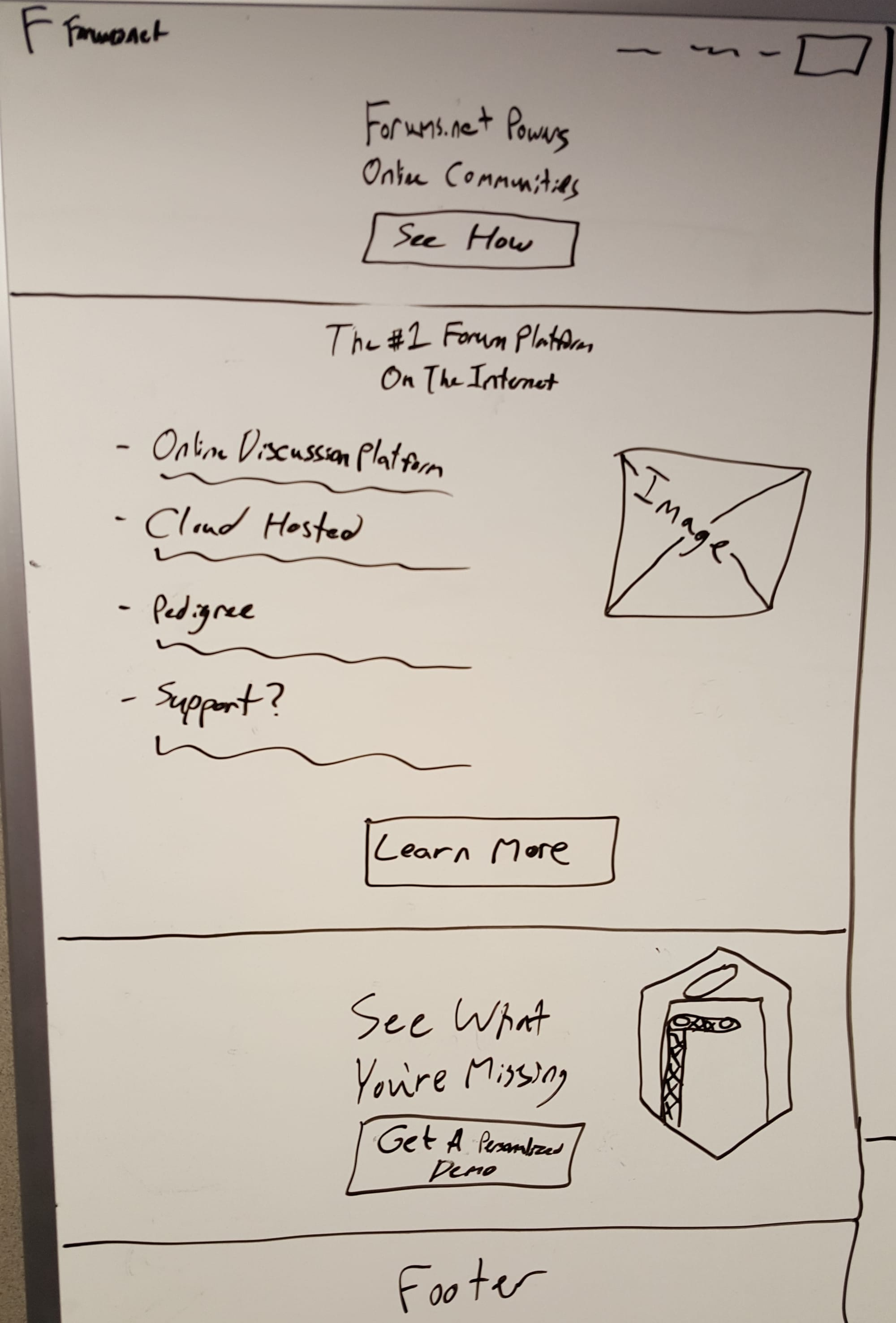
Problem
I was promoted from developer to product manager a month before the launch date of Forums.net. I spent that first month fighting fires and getting the product out the door on time. Yet, it didn’t take long after the launch to notice that something had gone very wrong. Our market research had shown there was an available opportunity, and we believed it. Regardless, we were seeing a disastrously low number of sign-ups.
Action
Forums.net focused on small businesses, a new market for us, so we couldn’t rely on our normal customer feedback channels. I arranged for a couple of our staff to spend a few days doing some guerrilla user testing. Armed with laptops, webcams, and screen recording software, I sent them to a local community college. The idea was to find entrepreneurs and marketers who would be there taking classes and would have some downtime between classes to talk with us.
The user testing immediately revealed our mistake. We had spent so long building forums that we had disconnected from our customers. We were not intelligibly communicating our product and its benefits to users who were not already familiar with it. Most of our test subjects could not even figure out what our product actually was after looking through the homepage. Once they had it explained to them, they showed the interest we had expected.
Most of our test subjects could not even figure out what our product actually was after looking through the homepage.
With the root cause uncovered, we knew that it was critical to move quickly. We had a short window to fix things to avoid squandering the marketing opportunity of our launch window. To get buy-in, I worked with our marketing team to put together a short highlight reel of user reactions. This aligned the whole team around the problem we needed to solve.
To solve it, I pitched the idea of doing a design sprint patterned after the Google Ventures model, which the CEO approved after some hesitation. I pulled together a team from around the company, staked out the conference room for a week, and bought a giant pile of sticky notes.
I led the week-long design sprint where we radically redesigned the key pages of the website's funnel. The end result featured brand new copy, more prominent product imagery, and focused messaging on the user benefits of the product. We capped the week off with a day of further guerrilla user testing. The results gave us confidence that our new design was much clearer and would convert at a higher rate.
Result
Launching the redesigned version of the website had an immediate and overwhelming effect. Sales increased by over 200% in the first month alone and continued to trend upwards in the following months. This also pushed the company to integrate earlier and more frequent rounds of user feedback into the development process.